ImageButton Background with Shape Drawable
In this tutorial a background is set on an ImageButton to change its appearance. The article also shows how the ImageButton's appearance can be easily changed without the need to edit the image assigned to the button. This is done by changing the background for the ImageButton with a shape drawable.

(This Android ImageButton background tutorial assumes that Android Studio is installed, a basic App can be created and run, and the code in this article can be correctly copied into Android Studio. The example code can be changed to meet your own requirements.)
Prepare the App and the Images for the ImageButton
For this ImageButton tutorial a new project is created in Android Studio, here called ImageButton. An Empty Activity was used and all other settings left as default. On the app's screen, activity_main.xml, the TextView showing Hello World! is deleted.
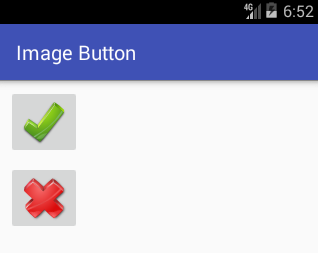
A graphic is required for use with the ImageButton. Here a couple of buttons will be used one to show a red cross and another a green tick. Using images from the Open Clip Art Library, a good source of free graphics, or use your own.


(To see how images from the Open Clip Art Libray can be converted into PNGs see the article Android Launcher Icons Using Inkscape or Free Android Icons Using OpenClipArt.org and Paint.NET.)
The images are also on the free Android Graphic Resources page. Use the greentick.zip and redcross.zip files, unzip them into the project, adding the contents to the project's res folder.
Add the ImageButtons to the App
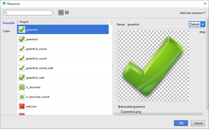
With the activity_main.xml layout file open drag and drop an ImageButton from the Images on the Palette. A Resource Chooser dialog will open. Select the greentick drawable. (If the ConstraintLayout is used add the required constraints.)

Do the same for the red tick, dragging and dropping an ImageButton on to the screen and selecting the redtick drawable graphic. With the graphics set for the two ImageButtons they are ready to be used by adding code to handle the onClick event, see Different Ways to Code Android Event Listeners.

Define the Background Shape Drawable
To improve the buttons appearance the background attribute for the ImageButton can be set. This is more flexible than modifying the image used by the button itself. The background attribute supports images but it also supports shapes defined in XML. The XML files are also drawables, so sit in the res/drawable folder. Unlike images it is not necessary to produce a version for all screen densities. To add a shape drawable background for the ImageButtons begin by creating a new shape XML file.
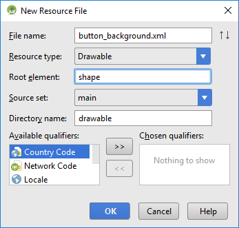
With app highlighted in the Project select New from the context menu (normally right-click) or from the main File menu. Select Android resource file, use button_background.xml for the File name, Drawable for the Resource type and shape as the Root element then press OK.

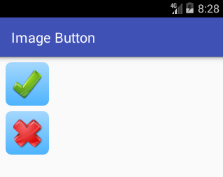
By setting appropriate gradient, padding and corners elements on a shape, and assigning it to the background attribute for the buttons, they are given a rounded button appearance. Edit the background_button.xml to have the following code:
<?xml version="1.0" encoding="utf-8"?>
<shape xmlns:android="http://schemas.android.com/apk/res/android">
    <gradient android:startColor="#B07FC9FF" android:endColor="#B00094FF" android:angle="270"/>
    <padding android:left="7dp" android:top="7dp" android:right="7dp" android:bottom="7dp"/>
    <corners android:radius="8dp"/>
</shape>
Set the ImageButton Background Attribute
Use the Properties list for the ImageButton to set the Background property to @drawable/button_background (it can be selected using the ellipsis). The code for the activity_main.xml layout file should look something like this:
<?xml version="1.0" encoding="utf-8"?>
<android.support.constraint.ConstraintLayout xmlns:android="http://schemas.android.com/apk/res/android"
    xmlns:app="http://schemas.android.com/apk/res-auto"
    xmlns:tools="http://schemas.android.com/tools"
    android:layout_width="match_parent"
    android:layout_height="match_parent"
    tools:context="com.example.imagebutton.MainActivity">

    <ImageButton
        android:id="@+id/imageButton"
        android:layout_width="wrap_content"
        android:layout_height="wrap_content"
        android:layout_marginLeft="8dp"
        android:layout_marginStart="8dp"
        android:layout_marginTop="8dp"
        android:background="@drawable/button_background"
        android:contentDescription="Green Tick Button"
        app:layout_constraintLeft_toLeftOf="parent"
        app:layout_constraintTop_toTopOf="parent"
        app:srcCompat="@drawable/greentick" />

    <ImageButton
        android:id="@+id/imageButton2"
        android:layout_width="wrap_content"
        android:layout_height="wrap_content"
        android:layout_marginLeft="8dp"
        android:layout_marginStart="8dp"
        android:layout_marginTop="8dp"
        android:background="@drawable/button_background"
        android:contentDescription="Red Cross BUtton"
        app:layout_constraintLeft_toLeftOf="parent"
        app:layout_constraintTop_toBottomOf="@+id/imageButton"
        app:srcCompat="@drawable/redcross" />
</android.support.constraint.ConstraintLayout>
Here is the ImageButtons with a shape drawable:

Try different shape elements to see the effect on the ImageButton appearance. See the Android documentation on the Shape Drawable. The following shows some of the possible variations achieved, by setting the android:shape attribute on the shape root element, changing the color and its transparency, removing the padding element etc.
Variations on Button Background

android:shape="oval" on shape element
 No padding element
 Transparency of colors reduced (from B0 to 50)
 Color changed (startColor="#B0FFE97F", endColor="#B0FFD800")

<solid android:color="#0094FF"/> instead of gradient and no transparency set
 Larger corners radius of 18dp

<stroke android:width="5dp" android:color="#7F0000"/>
 Example of a dashed outline for the stroke:
<stroke android:width="4dp" android:color="#7F0000"
    android:dashGap="4dp" android:dashWidth="10dp" />
Acknowledgements
The Green Tick and Red Cross are from openclipart.org.
See Also
- For a full list of all the articles in Tek Eye see the full site Index.
Author:Daniel S. Fowler Published: Updated:


