Add a Border to an Android Layout
The User Interface (UI) for an Android Application (App) must be easy to use, intuitive and pleasing to the eye. With Android Studio and the Software Development Kit (SDK) it is easy to generate screens, but the developer should add a little extra to make the interface attractive. Fortunately the SDK allows for enhancements to the UI using attributes on layouts and views. These attributes affect the UI appearence when a screen is displayed. The background attribute is one of the most versatile, it can be used to set colors, images, nine patch files and shapes. In this example project a simple Android shape is used to add a rectangular border with rounded corners to a layout file.

(This Android border tutorial assumes that Android Studio is installed; a basic App can be created and run; and code can be correctly copied into Studio. For this test App the Application name is called Layout Border and an Empty Activity is used. You are free to change this example for your own requirements. When entering code in Studio add import statements when prompted by pressing Alt-Enter.)
Drawable Folder
In an Android App project the drawable folder holds graphical resources (part of a wide range of Android resources that a project can have). Different types of drawables include image bitmaps (e.g. PNG or JPG) and XML definitions of shapes, colours and animations. Any drawable can be referenced from any screen. (In earlier versions of Android the res/drawable folder also stored an App's launcher icon. Now launcher icons are located in the mipmap folders.) This screenshot example shows a drawable defining a horizontal line:

Creating the Border Drawable
Add a file called customborder.xml to the drawable folder. (In the Project explorer highlight the res/drawable folder. Use the context menu, normally right-click, or the File menu and select New then Drawable resource file. In the New Drawable Resource File dialog enter a File name of customborder. Set the Root element to shape. Click OK.. Click OK.) Code is added to define a rectangle that has rounded corners, some padding and a solid color:
<?xml version="1.0" encoding="utf-8"?>
<shape xmlns:android="http://schemas.android.com/apk/res/android" android:shape="rectangle">
    <corners android:radius="20dp"/>
    <padding android:left="20dp" android:right="20dp" android:top="20dp" android:bottom="20dp"/>
    <solid android:color="#CCCCCC"/>
</shape>- On the root shape element the attribute android:shape is set to rectangle (shape files also support oval, line and ring). Rectangle is the default value so this attribute could be left out if a rectangle is being defined. See the Android documentation on shapes for detailed information on a shape file.
- The element corners sets the rectangle corners to be rounded, it is possible to set a different radius on each corner (see the Android reference).
- The padding attributes are used to move the contents of the View to which the shape is applied, to prevent the contents overlapping the border.
- The border color here is set to a light gray (CCCCCC hexadecimal RGB value).
Shapes also support gradients but that is not being used here, again see the Android documentation to see how a gradient is defined. To use the shape reference the drawable from a layout or view using the android:background attribute, in this case it would be used with android:background="@drawable/customborder".
Add the Border to a Layout
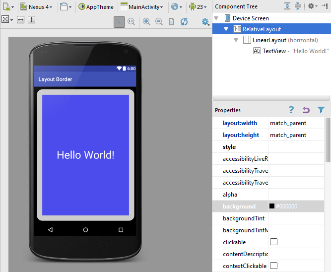
This shape border is added, for a panel effect, to a layout, to which other views can be added as normal. Here the root RelativeLayout background is set to black (#000000, a hexadecimal alpha RGB value) and padding set to 10dp to help the border stand out. Drag and drop a LinearLayout onto the screen and set the border background (android:background="@drawable/customborder"). In this example the existing single TextView is moved onto the LinearLayout. Tip: If required use the Component Tree to move Views and Widgets around. The TextView's background is set to blue, plus some transparency to reduce the brightness (#A00000FF). The TextVew text is set white (#FFFFFF), enlarged (android:textSize="40sp") and centered (android:gravity="center_vertical|center_horizontal"). The layout code in activity_main.xml in the res/layout folder should be similar to this:
<?xml version="1.0" encoding="utf-8"?>
<RelativeLayout xmlns:android="http://schemas.android.com/apk/res/android"
    xmlns:tools="http://schemas.android.com/tools"
    android:layout_width="match_parent"
    android:layout_height="match_parent"
    android:background="#000000"
    tools:context="com.example.layoutborder.MainActivity"
    android:padding="10dp">

    <LinearLayout
        android:orientation="horizontal"
        android:layout_width="match_parent"
        android:layout_height="match_parent"
        android:background="@drawable/customborder">

        <TextView
            android:layout_width="fill_parent"
            android:layout_height="fill_parent"
            android:text="Hello World!"
            android:background="#A00000FF"
            android:gravity="center_vertical|center_horizontal"
            android:textColor="#ffffff"
            android:textSize="40sp" />
    </LinearLayout>

</RelativeLayout>
Play around with values and attributes to see what effect they have on the layout. Use the Android documentation to understand what the attributes do. Try adding other layouts and controls to experiment with different looks. Getting an App to look good adds to it's appeal.

Download the code for this article ready for importing into Studio. The code can also be accessed via the Android Example Projects page. A version of this article appears in the Android Cookbook.
Archived Comments
2012/02/15 at 12:13 pm - Daniel - I found it very useful. Thanks.
But I have a little question. Can I have a white background and give a color only to the border of the button?
2012/02/15 at 8:15 pm - Tek Eye - In reply to Daniel.
Buttons need three drawables to be fully supported; for the normal, focus and pressed states. By default 9-patch files are used for button backgrounds. XML shape files can be used as well, to get what you require stack two shapes with different colors using a layer-list:
<layer-list xmlns:android="schema-address">
    <item>
        <shape>
            <corners android:radius="5dp"/>
            <padding android:left="5dp" android:right="5dp" android:top="5dp" android:bottom="5dp"/>
            <solid android:color="#FFCCCCCC"/>
        </shape>
    </item>
    <item>
        <shape>
            <padding android:left="4dp" android:right="4dp" android:top="4dp" android:bottom="4dp"/>
            <solid android:color="#FFFFFFFF"/>
        </shape>
    </item>
</layer-list>
Save it in the drawables folder, use it like other drawables. To support button states you’ll need three different versions referenced from a selector drawable.
2012/08/13 at 2:22 pm - Erez - Thanks, very helpful and clear!
Author:Daniel S. Fowler Published: Updated:


