ImageButton Graphics with Inkscape Example
A good User Interface should be intuitive and attractive. Sometimes simple pictures can replace words on a screen. Symbols, colors and pictures can make a screen attractive and easy to use. If the screen design requires buttons with symbols then the ImageButton can be used.
The ImageButton supports three visual states, normal, focused and pressed. Without a custom image the visuals for each state is determined by the default theme for the Android device. However, it is easy to add a custom image for each of the three states. This allows the ImageButton to be made unique. This article is a simple example of an Imagebutton with custom graphics.

This tutorial assumes that an app can be created and run in Android Studio. If not familiar with app programming in Studio then Tek Eye has beginners articles. For this tutorial use Android Studio to start a new app project, here called Button Press, with an empty Activity.
Creating Bitmaps for Android
All graphics for an app can be designed in free programs such as Inkscape, GIMP, or Paint.NET, as well as commerical programs like Photoshop. For this tutorial Inkscape is used to produce the images. It is a good program for producing graphics for the Android platform. Inkscape is:
- Fully featured
- Free
- Supports multiple screen densities (vector based)
- Access to thousands of free images via the Open Clip Art Library
- Plenty of online tutorials.
When creating graphics for apps work with vector images instead of raster (bitmap) images. It makes it easier to produce the variety of sizes needed for multiple screen densities. Those that are not familiar with working in Inkscape can use the built in (under the Help menu) and online tutorials at the Inkscape Tutorials Blog.
For this article an ImageButton is used to represent Play (or Start, or Go). The three images to be used can be built in Inkscape, or alternatively they are available from the Open Clip Art Library as a Scalable Vector Graphic (SVG) file:
| Image | State | App Name | openclipart File |
|---|---|---|---|
 |
normal | normal.png | A Blue Play Button |
 |
focus | focus.png | Blue Play Button With Focus |
 |
pressed | pressed.png | Play Button Green With Blue Border |
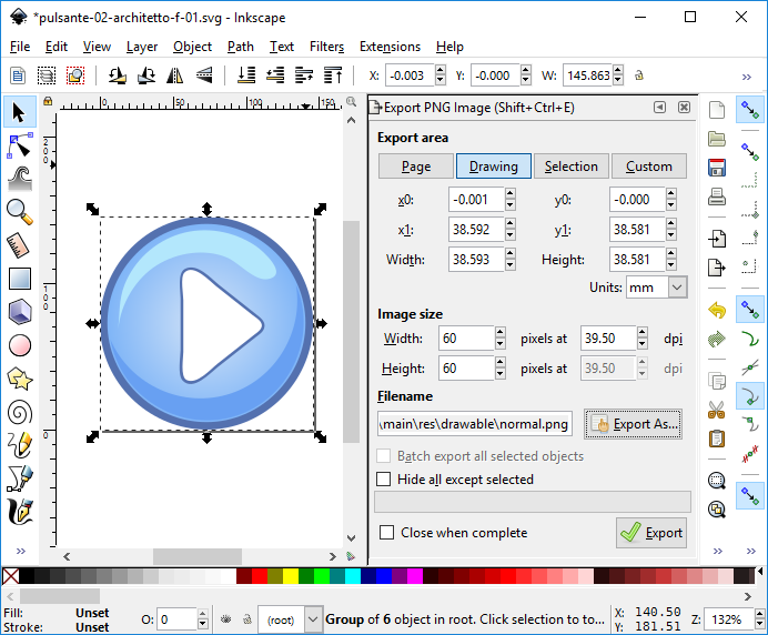
If an image is created, or an SVG file opened, in Inkscape then bitmaps for an ImageButton can be exported. Alternatively bitmaps can be generated directly from the Open Clip Art Library, if a suitable image is found that requires no changes. For an SVG file the Inkscape Export PNG Image... option is used to generate the correctly sized bitmaps (using the Width or Height boxes). Here the buttons were exported as 60 by 60 pixel images. The bitmap export format is Portable Network Graphics (PNG). These can be exported directly to the relevant drawable folder in the Android project.
Ideally bitmaps will be generated for the various screen densities possible on Android devices. Medium density (160dpi) is the default density. Images placed in the drawable folder will be scaled for different density screens unless an equally named file is in the correct folder under the res folder. These other folders are named: drawable-ldpi, drawable-mdpi (same as drawable), drawable-hdpi, drawable-xhdpi and drawable-xxhdpi. The relative sizes are shown in the following diagram.
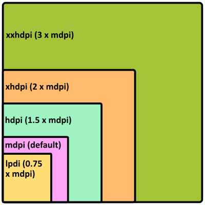
Thus a bitmap that is 60×60 pixels on a medium density screen would be scaled to 45×45 pixels on a ldpi screen, 90×90 on a hdpi screen, 120×120 on a xhdpi screen and 180×180 on a xxhdpi screen. Bitmaps produced from Inkscape for the various densities will reduce the pixellation that can occur from the automatic scaling of the default bitmap.
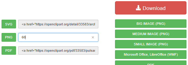
To generate a bitmap directly from an image's Open Clip Art Library page type the image size required into the box next to the PNG button. Clicking PNG to download a bitmap with its largest x or y dimension matching the typed in value in pixels (an image that is taller than it is wide will have y to the given dimension, an image wider than it is tall will have x to the given dimension). Copy the generated file to the relevant project drawable directory.
Adding State Graphics to an ImageButton
Update: Android now supports Multi-Density Vector Graphics.
Referencing an image is usually achieved by setting an attribute to the name of the file in a drawable folder (e.g. @drawable/imagefile.png). However, an ImageButton needs three images, with the correct image required being based upon the button's state. This is achieved via an XML selector file in the drawable directory. The relevant attribute (app:srcCompat in this case) then points to this XML file. Set up a selector file for the app:
- In Android Studio highlight the drawable folder in the Project explorer.
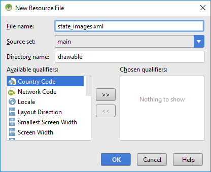
- Select the File menu then New and Drawable resource file.
- Set File name to state_images.xml, then press OK.
Three <item/> entries in the selector XML reference the images stored in the drawable folder. Add the three item entries to the new state_images.xml file as shown here (see Copying Code from the Articles if required):
<?xml version="1.0" encoding="utf-8"?>
<selector xmlns:android="http://schemas.android.com/apk/res/android">
    <item android:state_pressed="true" android:drawable="@drawable/pressed" />
    <item android:state_focused="true" android:drawable="@drawable/focus" />
    <item android:drawable="@drawable/normal" />
</selector>
It is important that the image for the normal state appears last in the selector file. Android tests the state of the button and if no image for the given state is in the list then the last image is used, which is for the normal state.
Drop an ImageButton on to the app's screen layout. The Resources dialog will open and the new state_images resource can be selected. This sets the app:srcCompat atrribute to @drawable/state_images.
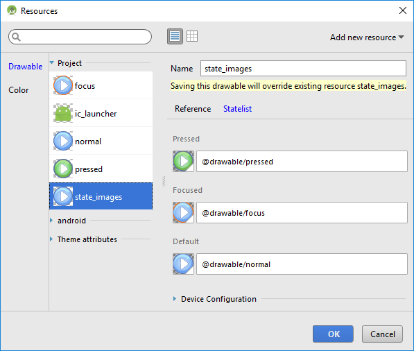
The ImageButton's android:backgroundTint attribute has been set to transparent, i.e. @android:color/transparent. Otherwise the defualt tint shows through because circular images are being used. (The transparent color can be selected using the ellipsis next to the BackgroungTint property. It pulls up the Resources dialog to allow scrolling throught the available colors.)
Add another ImageButton set up identically to the first. Add some TextViews for labels, here the textSize is set to 18sp (scaled pixels).
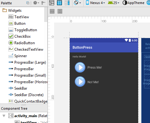
The layout file, under res/layout, should be similar to the following:
<?xml version="1.0" encoding="utf-8"?>
<RelativeLayout xmlns:android="http://schemas.android.com/apk/res/android"
    xmlns:app="http://schemas.android.com/apk/res-auto"
    xmlns:tools="http://schemas.android.com/tools"
    android:id="@+id/activity_main"
    android:layout_width="match_parent"
    android:layout_height="match_parent"
    android:paddingBottom="@dimen/activity_vertical_margin"
    android:paddingLeft="@dimen/activity_horizontal_margin"
    android:paddingRight="@dimen/activity_horizontal_margin"
    android:paddingTop="@dimen/activity_vertical_margin"
    tools:context="com.example.buttonpress.MainActivity">

    <TextView
        android:layout_width="wrap_content"
        android:layout_height="wrap_content"
        android:text="Hello World!"
        android:id="@+id/textView" />

    <ImageButton
        android:layout_width="wrap_content"
        android:layout_height="wrap_content"
        app:srcCompat="@drawable/state_images"
        android:layout_marginTop="12dp"
        android:id="@+id/imageButton"
        android:backgroundTint="@android:color/transparent"
        android:layout_below="@+id/textView"
        android:layout_alignParentLeft="true"
        android:layout_alignParentStart="true" />

    <ImageButton
        android:layout_width="wrap_content"
        android:layout_height="wrap_content"
        app:srcCompat="@drawable/state_images"
        android:id="@+id/imageButton1"
        android:backgroundTint="@android:color/transparent"
        android:layout_below="@+id/imageButton"
        android:layout_alignParentLeft="true"
        android:layout_alignParentStart="true" />

    <TextView
        android:text="Press Me!"
        android:layout_width="wrap_content"
        android:layout_height="wrap_content"
        android:layout_alignTop="@+id/imageButton"
        android:layout_toRightOf="@+id/imageButton"
        android:layout_toEndOf="@+id/imageButton"
        android:layout_marginTop="30dp"
        android:id="@+id/textView2"
        android:textSize="18sp" />

    <TextView
        android:text="No! Me!"
        android:layout_width="wrap_content"
        android:layout_height="wrap_content"
        android:layout_alignBottom="@+id/imageButton1"
        android:layout_toRightOf="@+id/imageButton1"
        android:layout_toEndOf="@+id/imageButton1"
        android:layout_marginBottom="26dp"
        android:id="@+id/textView3"
        android:textSize="18sp" />

</RelativeLayout>
Finish the Demo App
When running the demo app on the emulator the keyboard can be used to tab between the buttons to see the focus effect.
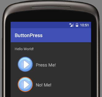
To add some feedback (counting button presses) add code similar to the following:
package com.example.buttonpress;

import android.support.v7.app.AppCompatActivity;
import android.os.Bundle;
import android.view.View;
import android.widget.TextView;

public class MainActivity extends AppCompatActivity {
    long howManyClicks1=0L; //count button clicks
    long howManyClicks2=0L;
    @Override
    protected void onCreate(Bundle savedInstanceState) {
        super.onCreate(savedInstanceState);
        setContentView(R.layout.activity_main);
        HandleClick hc=new HandleClick();
        findViewById(R.id.imageButton).setOnClickListener(hc);
        findViewById(R.id.imageButton1).setOnClickListener(hc);
    }
    private class HandleClick implements View.OnClickListener {
        public void onClick(View arg0) {
            if(arg0.getId()==R.id.imageButton)
                ((TextView) findViewById(R.id.textView2)).setText("Pressed: " + ++howManyClicks1);
            else
                ((TextView) findViewById(R.id.textView3)).setText("Pressed: " + ++howManyClicks2);
        }
    }
}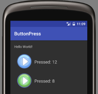
This example used circular buttons, many other shapes and styles can be achieved with Inkscape. An earlier version of this article was produced for the Android Cookbook.
Zipped Demo App
- If required download buttonpress.zip to get the code for importing into Android Studio.
- After importing a project to Studio if a Rendering Problems message is displayed when viewing layouts see the article Android Studio Rendering Problems.
- If an error Minimum Supported Gradle Version is shown see the article Minimum Supported Gradle Version Error in Studio.
- See this demo app and many other Android example apps, projects, code and articles on Tek Eye.
See Also
- Support for Multi-Density Vector Graphics in later versions of Android.
- Tek Eye has more Android articles listed in the full website Index.
Archived Comments
Mark Daniel on November 15, 2012 at 9:28 am said: I’ve started work on an Inkscape extension that lets you automatically export at multiple resolutions without having to do them all manually. It also supports exporting 9-patch PNGs. You can find it on CodePlex. Give it a go!
Author:Daniel S. Fowler Published: Updated:


